How to Create Tabs With JavaScript
Tabs are a user interface (UI) element used to organize content into separate sections. This element consists of two parts — clickable buttons called tabs and sections of content. When you click on a tab, the content associated with that tab is displayed, while other sections are hidden.
In this post, you will learn how to create your own tabs using JavaScript, HTML and CSS. Your tabs will switch between sections of content without navigating to another page.
You will also learn how to use ARIA attributes such as role and aria-selected to improve accessibility of your tabs.
If you want to see the final code and result in action, check it out here on CodePen.
Creating HTML Structure
The element that you are going to build consists of two parts — buttons, called tabs, and content sections, called panels. Tabs are used for navigation, while panels is where the content lives.
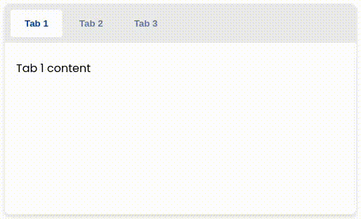
With that in mind, let’s add the HTML for the buttons and panels.
<div class="tabs">
  <div role="tablist">
    <button
      id="tab-1"
      aria-selected="true"
      aria-controls="tab-panel-1"
      role="tab"
      type="button"
    >
      Tab 1
    </button>
    <button
      id="tab-2"
      aria-selected="false"
      aria-controls="tab-panel-2"
      role="tab"
      type="button"
    >
      Tab 2
    </button>
    <button
      id="tab-3"
      aria-selected="false"
      aria-controls="tab-panel-3"
      role="tab"
      type="button"
    >
      Tab 3
    </button>
  </div>
  <div
    id="tab-panel-1"
    aria-labelledby="tab-1"
    role="tabpanel"
  >
    Tab 1 content
  </div>
  <div
    id="tab-panel-2"
    aria-labelledby="tab-2"
    role="tabpanel"
    hidden
  >
    Tab 2 content
  </div>
  <div
    id="tab-panel-3"
    aria-labelledby="tab-3"
    role="tabpanel"
    hidden
  >
    Tab 3 content
  </div>
</div>
Here’s what this HTML code is doing:
- Each tab has an
idso that its corresponding panel can use it in itsaria-labelledbyattribute to associate it with that tab - Each panel gets an
idso that each tab can describe viaaria-controlswhich panel it controls - The
roleattribute describes the tabs navigation withtabandtablistvalues and the content withtabpanelvalue - The
aria-selectedattribute can be used to describe which tab is currently active, first being the selected by default - The
hiddenattribute can be used to hide inactive panels, first being shown by default
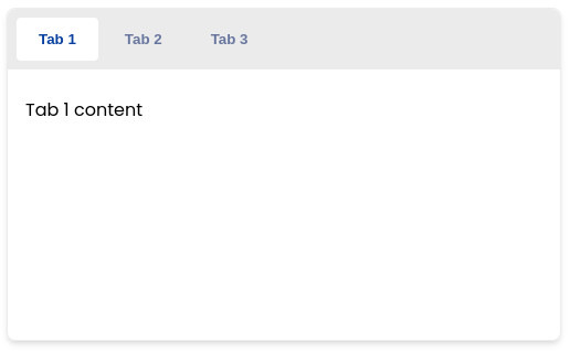
And here’s how it should look.
For the tablist, we use div element instead of nav because the tabs don’t behave like a group of links. You lose the tab state upon page refresh and it has no back functionality. If you were to create tabs that link to pages instead, that would be a different story.
Styling the Tabs
To change the looks of your tabs you can use role and aria-selected attributes.
You can use HTML attributes in your CSS selectors like this:
div[role="tablist"] { /* Match div with "tablist" role attribute */ }
button[role="tab"][aria-selected="true"] { /* Match active tab */ }
Of course, you can also add classes to each button and panel and style them that way instead.
First, add the following styles to give the tabs some shape and lay them out side by side.
.tabs {
  max-width: 500px;
  min-height: 300px;
  border: 1px solid #ececec;
  border-radius: 0.5rem;
  box-shadow: rgba(0, 0, 0, 0.1) 0px 4px 6px -1px, rgba(0, 0, 0, 0.06) 0px 2px 4px -1px;
}

div[role="tablist"] {
  display: flex;
  gap: 0.25rem;
  background-color: #d1d1d170;
  margin-bottom: 0.5rem;
  padding: 0.5rem;
  border-top-left-radius: 0.5rem;
  border-top-right-radius: 0.5rem;
}
Next, style the buttons.
button[role="tab"] {
  color: #67769e;
  background: none;
  border: none;
  border-radius: 0.25rem;
  padding: 0.75rem 1.25rem;
  cursor: pointer;
  font-weight: 700;
}
And, add styling for their hover and active states.
button[role="tab"][aria-selected="true"] {
  background-color: #ffffff;
  color: #07409f;
}

button[role="tab"][aria-selected="false"]:hover {
  color: #000000;
}
Here you are first adding style to the currently active tab. Then, the second rule changes text color on hover only for currently inactive tabs.
Finally, add some padding to the the panels.
div[role="tabpanel"] {
  padding: 1rem;
}
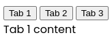
And here is the result.
That’s enough to make it look somewhat good. Feel free to adjust the styling as you wish.
Making the Tabs Functional
The final part is to make the tabs function by responding to button clicks.
The first step is to handle click events by adding event listeners to all buttons.
const tabElements = document.querySelectorAll('button[role="tab"]');
const panelElements = document.querySelectorAll('[role="tabpanel"]');
let activeIndex = 0;

// Listen to clicks on tabs
tabElements.forEach(function (tab, index) {
  tab.addEventListener("click", function (event) {
    setActiveTab(index);
  });
});
First, you get all tab and panel elements using querySelectorAll method.
Then, you keep track of which tab and panel is active by saving their corresponding array index value inside activeIndex variable.
This assumes that the tabs and panels share the same order in HTML.
By default, you can assume that the first tab and panel is active, which means that activeIndex is 0.
After that, you attach an event handler for the click event on each tab. With the help of forEach array method, you can loop over all tabs, accessing each one through the tab argument and its index value through index argument.
When a tab is clicked, it calls setActiveTab function, passing in the argument the index of the clicked tab.
The setActiveTab function needs to make the currently active tab inactive and set the new tab as active.
function setActiveTab(index) {
  // Make currently active tab inactive
  tabElements[activeIndex].setAttribute("aria-selected", "false");

  // Set the new tab as active
  tabElements[index].setAttribute("aria-selected", "true");

  setActivePanel(index);
  activeIndex = index;
}
Furthermore, this function calls setActivePanel that we will implement next to update the active panel as well. And finally, it saves a new activeIndex value.
The setActivePanel function hides the currently active panel and shows the newly activated panel.
function setActivePanel(index) {
  // Hide currently active panel
  panelElements[activeIndex].setAttribute("hidden", "");

  // Show the new active panel
  panelElements[index].removeAttribute("hidden");
}
This is enough for creating basic tabs, but there are more things you can do to improve the user experience.
Improving the Accessibility Further
Now that the tabs are styled and functional, its time to make them even better.
If you try navigating using the tab key, you will notice that you can only focus the buttons. There is no way to focus the panel using the keyboard.
You can fix that by adding the tabindex attribute to the active panel.
<div
  id="tab-panel-1"
  aria-labelledby="tab-1"
  role="tabpanel"
  tabindex="0"
>
  Tab 1 content
</div>
<div
  id="tab-panel-2"
  aria-labelledby="tab-2"
  role="tabpanel"
  tabindex="-1"
  hidden
>
  Tab 2 content
</div>
<div
  id="tab-panel-3"
  aria-labelledby="tab-3"
  role="tabpanel"
  tabindex="-1"
  hidden
>
  Tab 3 content
</div>
A value of 0 in tabindex allows you to focus the element using your keyboard. On the other hand, a value of -1 makes the element unavailable for selection, which you want for the hidden panels.
Adjust the JavaScript code to dynamically swap the tabindex value between the active and inactive panels.
function setActivePanel(index) {
  // Hide currently active panel
  panelElements[activeIndex].setAttribute("hidden", "");
  panelElements[activeIndex].tabIndex = -1;

  // Show the new active panel
  panelElements[index].removeAttribute("hidden");
  panelElements[index].tabIndex = 0;
}
Another thing you should do regarding navigation is to make it so that after focusing a tab, next thing that is focused is its panel, instead of another tab. Currently, you have to cycle through all tabs to get to the content of active tab.
You can fix that by setting tabindex to -1 on inactive tabs.
<button
  id="tab-1"
  aria-selected="true"
  aria-controls="tab-panel-1"
  role="tab"
  type="button"
  tabindex="0"
>
  Tab 1
</button>
<button
  id="tab-2"
  aria-selected="false"
  aria-controls="tab-panel-2"
  role="tab"
  type="button"
  tabindex="-1"
>
  Tab 2
</button>
<button
  id="tab-3"
  aria-selected="false"
  aria-controls="tab-panel-3"
  role="tab"
  type="button"
  tabindex="-1"
>
  Tab 3
</button>
And adjusting the JavaScript to set the correct tabindex on the active tab, just like with the panels.
function setActiveTab(index) {
  // Make currently active tab inactive
  tabElements[activeIndex].setAttribute("aria-selected", "false");
  tabElements[activeIndex].tabIndex = -1;

  // Set the new tab as active
  tabElements[index].setAttribute("aria-selected", "true");
  tabElements[index].tabIndex = 0;

  setActivePanel(index);
  activeIndex = index;
}
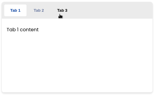
Now, you can jump straight to the content inside the active panel after focusing the active tab.
The problem with this approach is that you can no longer navigate the tabs with keyboard. Let’s fix that next.
Adding Keyboard Navigation to Tabs
Let’s add an event listener for keydown event to each tab. This event is fired when you press a keyboard button while a tab is being focused, either by navigating with tab key or by clicking it.
// Listen to clicks and key presses on tabs
tabElements.forEach(function (tab, index) {
  // ✂️

  tab.addEventListener("keydown", function (event) {
    const lastIndex = tabElements.length - 1;

    if (event.code === "ArrowLeft" || event.code === "ArrowUp") {
      event.preventDefault();

      if (activeIndex === 0) {
        // First element, jump to end
        setActiveTab(lastIndex);
      } else {
        // Move left
        setActiveTab(activeIndex - 1);
      }
    } else if (event.code === "ArrowRight" || event.code === "ArrowDown") {
      event.preventDefault();

      if (activeIndex === lastIndex) {
        // Last element, jump to beginning
        setActiveTab(0);
      } else {
        // Move right
        setActiveTab(activeIndex + 1);
      }
    } else if (event.code === "Home") {
      event.preventDefault();

      // Move to beginning
      setActiveTab(0);
    } else if (event.code === "End") {
      event.preventDefault();

      // Move to end
      setActiveTab(lastIndex);
    }
  });
});
In the keydown event handler function, you should address the following things:
- Pressing left or up arrows should switch to previous tab, or to the last tab if the first tab is currently focused
- Pressing the right or down arrows should switch to next tab, or to the first tab if the last tab is currently focused
- Home and end keys should jump to the first and last tabs respectively
- You can call
event.preventDefault()to prevent the page from scrolling while navigating between tabs
One last thing — you need to focus the tab that you have navigated to with the keyboard.
function setActiveTab(index) {
  // Make currently active tab inactive
  tabElements[activeIndex].setAttribute("aria-selected", "false");
  tabElements[activeIndex].tabIndex = -1;

  // Set the new tab as active
  tabElements[index].setAttribute("aria-selected", "true");
  tabElements[index].tabIndex = 0;
  tabElements[index].focus();

  setActivePanel(index);
  activeIndex = index;
}
The Result
Following this post, you have created a functional tabs element using plain JavaScript with some HTML and CSS.
You learned how to use ARIA attributes for the tabs UI element to improve its accessibility.
Later you used those ARIA attributes in CSS selectors to give your tabs some style.
Finally, you added keyboard navigation to the tabs.
You can see the final code here on CodePen.